I'm trying not to make them TOO girly, since our baby shower is actually going to be more of a house party - with baby gifts. :D
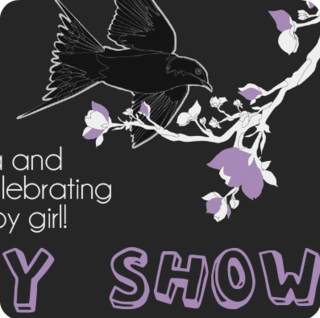
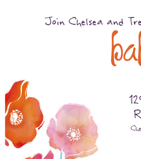
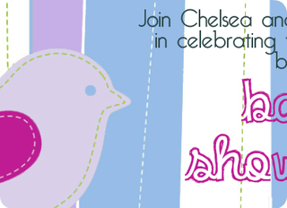
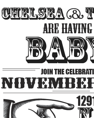
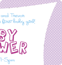
I still need to come up with a couple more, then print some comps at work. All the people who are involved in the baby shower planning are busy busy people, and I'm not about to be the mom-to-be who sits there watching her friends slave away during the party. I'm definitely going to be involved, and the invitations are just the start.
Which one do you like?
I'm torn between the 2nd and 3rd design. Something about the black crow doesn't scream "beautiful baby" to me, for some reason. When's the shower?
ReplyDeleteTrev said the same thing about the black crow. I still like the design of it, just maybe not for a baby shower. I think I'm going to use the greys, cream, and light purple in our bedroom instead. I do really like the font for that one tho.
ReplyDelete#2 gets my vote... the blackbird is saying "graveyard" to me. i like those purples though. my guest bedroom is royal eggplant and gold right now. word.
ReplyDelete