Love photoshop, lol.
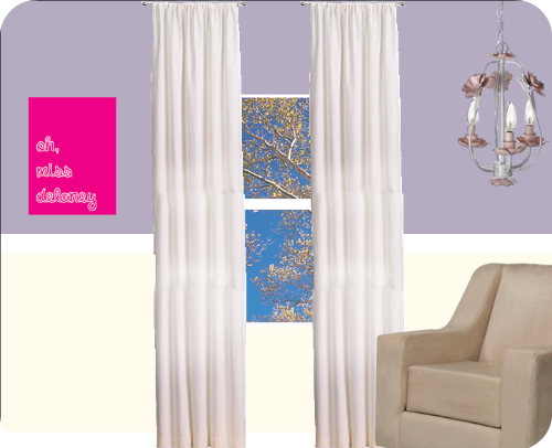
So, the pink "oh miss delaney" box is this DIY project from Design Sponge, making a nightlight out of a stretched, painted canvas. The chandelier is from Target, and the glider is my dream chair from Babys R Us. Too bad it's like $400. :( If I don't get it, I'm still perfectly happy with the rocker I re-did, I just love the modern lines, the comfort, and the fact that it's called "Marshmallow".
Emmalie and I spent 5 hrs baby shopping in Marin today, and I was SO inspired! Giggle had a TON of Dwell products (far too expensive) and I found a cute cute baby store, Janie and Jack, that was just clothes, but amazing adorable. I found a sweet hot pink hoodie that I almost bought full price until my dear friend took it out of my hands. (Part of their Parisian Park collection. I made up for it for getting $100.99 worth of infant outfits for $15 at Macy's.
I decided I want to change our bedroom, the light green on the wall, and the dark green on the ceiling are bumming me out. I think I'm going to use the different shades of grey, creams, and light purples from the Crow baby shower invite in there instead. I'm so drawn to them!
Right now tho, I'm pooped, and I still have a flea bath to administer and dishes to wash. Trevor James will be home in 2 hrs, so I guess I should get started. After Dear Genevive, swear.
Wow I think its gonna look great. Kudos to all your great deals!
ReplyDeleteEw, I just realized my colors might not come across that great using Photobucket. (on mylaptop, you can see the butter yellow on the bottom, on my imac, not so much.) Maybe it's time to switch to flikr?
ReplyDeleteI can see the butter yellow, it looks great! Yep, I like this idea a lot better than the solid color throughout! (With all the comments on your blog, I hope my opinion means something, since I'm so ridiculously design-challanged!)
ReplyDelete